Redesigning the information architecture (IA) of Volunteer Waterloo Region’s website to better serve its users and to strive towards its mission statement.
Note: This project was completed in Q4 of 2023 and does not reflect the VWR website that is presently live on the web.

Volunteer Waterloo Region is a non-profit based in Kitchener and serves the broader Regional Municipality of Waterloo and its townships. The purpose of their website (volunteerwr.ca) is to connect local organizations or event organizers with prospective volunteers of various age-groups and backgrounds. A secondary purpose of the VWR website is to serve as a landing page or collection of resources and reference material relating to volunteerism.
The primary user groups of the VWR website are current volunteers, prospective volunteers, non-profit or charitable organizations, and employees of VWR. For the sake of scope in this project both current and prospective volunteers were treated as the target user group. While most team members have previously volunteered or have familiarity with the process, we conducted secondary research to validate these assumptions with a review of literature that explores the more-broadly studied information needs of volunteers.
In the context of prospective or current volunteers, the most common information seeking behaviours include:
This was followed by the identification of the users’ most common information needs. At this part of the empathy stage, we imagined situations or tasks that users would likely encounter and then identified the particular information need they would be experiencing.
The hierarchical graphing of the website content provided insight into the content distribution, organization and its navigation through a comprehensive visual representation. In creating a hierarchical graph of the VWR website, we identified issues with the dissemination and representation of information on their website.


At a high level, there were four overarching problem areas identified following a content inventory of the website. Below each problem area are some examples of the issues identified by the team.
.gif)
Encountering broken links can give the user the appearance of an outdated and poorly maintained site, reducing users’ trust in this non-profit. For example, the Donate page has a call to action button that leads to a broken CanadaHelps.org out-link.

The top-level navigation / global menu features a mix of directly clickable headers, and headers which reveal drop-downs to sub-nested pages. The redundancy is that in all instances, the first link in the drop-down is clickable and leads to a page of the same name as the header title.


Throughout the website, there are links to subscribe to three separate volunteering newsletters – all of which seemingly share the same content and advertised volunteering opportunities. The terms agency category and areas of interest are both used seemly interchangeably to refer to the different sector and industry areas that an organization operates within.

While the website regularly updates with new volunteer postings and opportunities, it does not provide the user with clear signs as to when new content is posted.
36 participants completed this unmoderated open card sort activity. The goal of this testing was to understand how participants would group information together, the title or name of those groupings and their mental model of the site’s content.
From the card sort, high-level groupings, naming of certain labels, pages and its organization were informed from the similarity matrix, skeptical and best merge dendrograms, along with the titles of different groupings provided by participants.

It is important to note that the presentation of this particular configuration of groupings required interpretation of the participants’ card sort results, the diagrams and many data visualizations tools provided by the OptimalSort platform. It also required the identification and exclusion of response outliers, identifying when participants misinterpreted the label name and/or the content that it currently represents on the VWR website.

The tree test consisted of participants navigating through a number of paths and pages built within Optimal Workshop’s Treejack testing environment; wherein each “tree” was representative of different possible iterations of the VWR website. The participants were presented tasks representative of a typical visit to the website, locating a particular kind of volunteer position and a system administration task.
Task 1: Find non-profit agencies or groups that offer volunteering positions in healthcare settings, like hospitals.
Task 2: Set up email alerts to notify you when volunteer positions matching your preferences become available.
The first tree test represented the existing navigational structure of the VWR website (test A). It was used to benchmark our future changes to the site in order to compare success, directness and pie tree graphs to assess overall whether improvements had been made.


Tree test B featured changes in the naming and organizational structure of various button labels and page titles. When compared against the benchmark tree test (A), there was a non-statistically significant difference in the success rate, the directness, and the overall task score. Thus, we decided to conduct a second revised tree (C) test which gave us the opportunity to tweak the placement and naming of certain pages/buttons, and to reach out to more participants.
Tree Test C - Task 1

Tree Test C - Task 2

With the overall success percentage staying consistent at about 75%, the directness increased from 36% to 56% between the iterations of proposed changes.
Tree Test B - Task 2

Tree Test C - Task 2

Ultimately, the tree test participants were more successful using the newly proposed navigational structure, as they went down fewer wrong paths at a higher rate of directness.


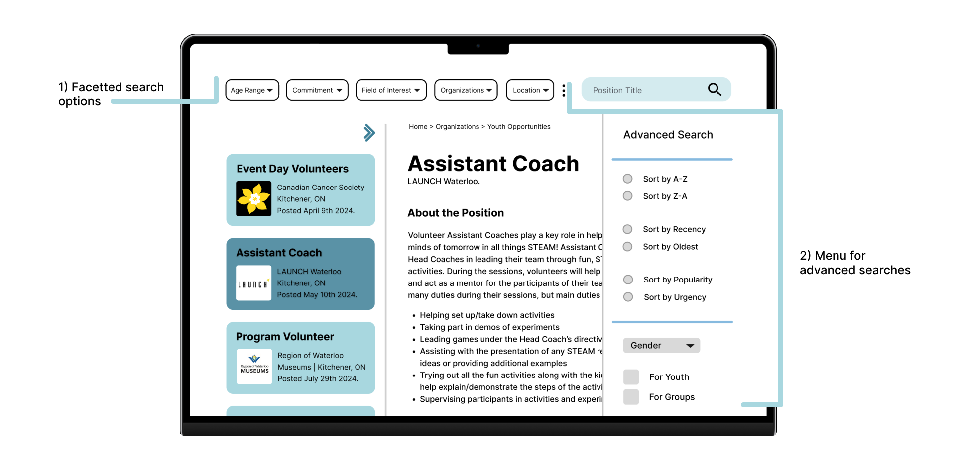
The prototyping phase began with mapping out the connections between the new pages and the desired content within them. The sitemap highlights some suggested changes including how the website’s content should be labelled and structured. It also features a more robust and streamlined advanced search feature, giving users the ability to sort content in ways that would be most relevant to them.
With the addition of advanced search facets and many options for sorting the search results, this will help to accelerate the search process for users, narrow down the number of results, and ultimately make it easier for users to perform the necessary information seeking behaviours.

Our team designed 8 principle wireframes to visually represent these highest-level pages and the accompanying global, local, contextual and utility navigation. The information architecture at this wireframing stage largely resembled (and built off of) the layout of content tested in tree test C. These wireframes also allowed us to visualize the following changes / additions to the user’s information search process.
User Information Search:
To best visualize these changes for our client, the next step was to translate these designs into an interactive mid-high fidelity prototype. Designed in Figma, this responsive design demonstrates the aforementioned search functions and proposed UI improvements.


Overall, this project was an amazing experience and gateway to the concept of information architecture (IA) and its importance in user experience, especially in digital products. The content inventory, card sort, tree testing, sitemap and wireframe design tasks were a practical way of applying the knowledge that I’ve gained throughout this Information Design course. It has equipped me with the necessary vocabulary to diagnose and describe the many IA issues that were prevalent in Volunteer Waterloo Region’s website.
In first weeks of the project, I was introduced to the Information Architecture Process and the skills involved in conducting these IA research methods. I learnt the proper way to conduct closed card sort studies and tree testing using industry standard UX research platforms like Optimal Workshop. In the later stages of the project, applying the suggested IA changes to a wireframe sketch of the website helped to reiterate and illustrated the background and user-driven reason for conducting these research methods.
Some next steps include exploring further user research and test methods that were initially out of scope during the project’s initial run. It would be beneficial to engage in dialogue and conduct interviews with VWR employees to learn more about their involvement in maintaining or updating the website. This would help to clarify the uncertainty regarding the website’s back-end design and architecture of the website’s content.
At the time of the project, my team and I could only speculate and make informed guesses as to how the website was built; if it used a CRM or used a database to organize the all information presented in the website. Rooting a new website design in data-driven research helps to best support the information seeking needs and overall required tasks of VWR employees and employees from other organizations.
Furthermore, cognitive walkthroughs of the website should be conducted to gather data on the changes made and their perceived benefits to users. Usability tests should also be considered to test the suggested design and IA changes. Additionally, these results should be benchmarked against the metrics measured user testing on the existing VWR website.